Francis Stieglitz

Konzept & Interface   concept & interface

  • Stadtraum
    MVG-Fahrrad
  • Stadtraum
    MVG-Fahrrad
  • Stadtraum
    MVG-Fahrrad
  • Stadtraum
    MVG-Fahrrad
  • Stadtraum
    MVG-Fahrrad

MVG-Fahrrad Datenvisualisierung

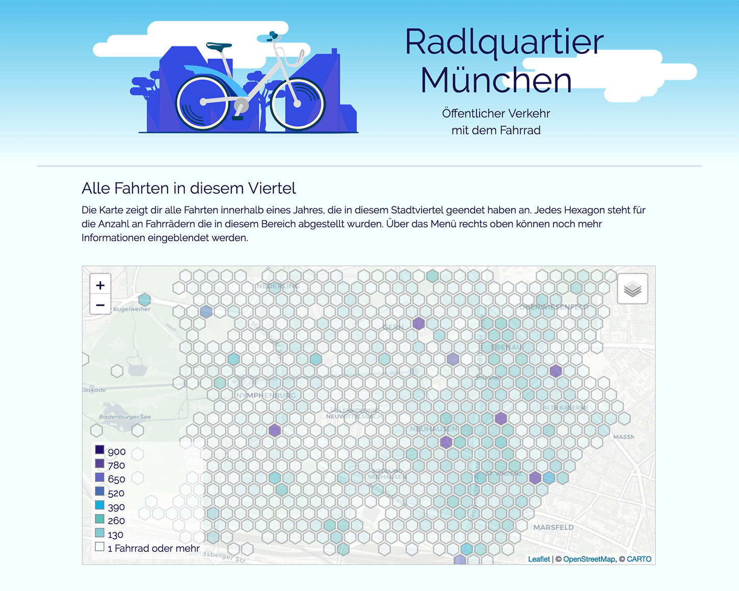
Im Rahmen eines freien Projektes im Bereich Interfacedesign entstand die Website 
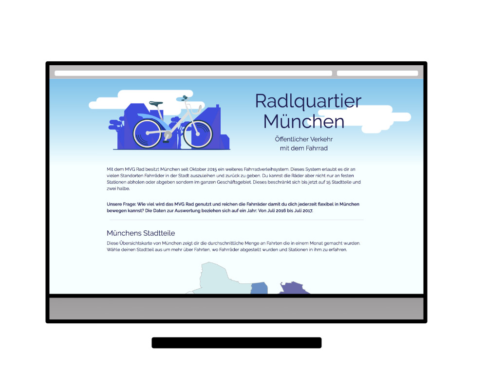
Radlquartier München in Zusammenarbeit mit dem OK Lab München. Ziel des Projekts ist die Auswertung und Visualisierung von unterschiedlichen 
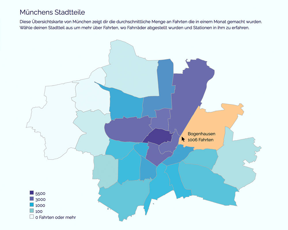
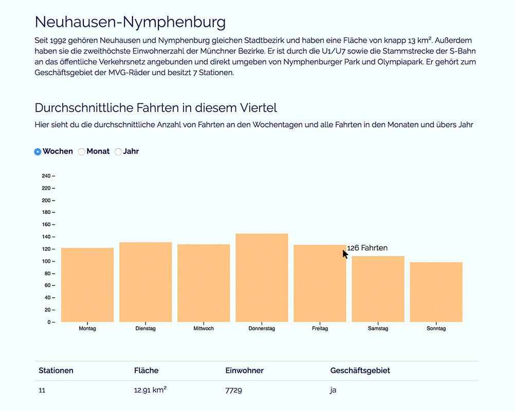
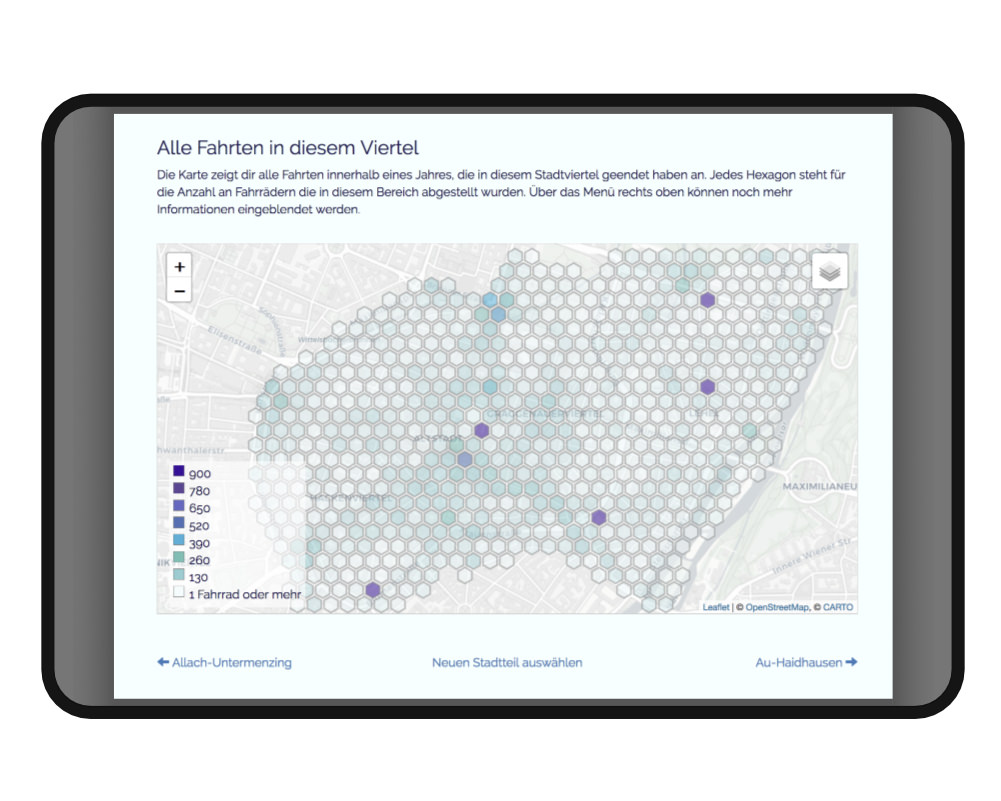
Bikesharing Diensten. In einem ersten Schritt zeigt die Website eine Stadtteil bezogene Visualisierung der MVG Rad Daten. Sie ermöglicht es den Bürger*innen sich ein Bild von der Verbreitung und Nutzung der Fahrräder in ihrem Stadtteil zu machen. In einem zweiten Schritten sollen die Daten von mehr Bikesharing Diensten eingebunden werden, so können unterschiedliche Anbieter miteinander verglichen werden. Das Projekt ist Open-Source und soll für andere Städte übernommen werden können.

Betreuung: Prof. Matthias Edler-Golla - Freies Projekt

The Website Radlquartier München is a free project in the field of interface design. The website was created in cooperation with OK Lab München. The aim of the project is the evaluation and visualization of different bikesharing services. In a first step the website shows a visualization of the „MVG Rad“ Data related to the city district. It enables citizens to get an idea of the distribution and use of bicycles in their district. In a second step, the data from more bikesharing services are to be integrated so that different providers can be compared with each other. The project is open source and should be able to be adapt for other cities.

  • Stadtraum
    Stadtraum
  • Stadtraum
    Stadtraum
  • Stadtraum
    Stadtraum
  • Stadtraum
    Stadtraum
  • Stadtraum
    Stadtraum
  • Stadtraum
    Stadtraum
  • Stadtraum
    Stadtraum
  • Stadtraum
    Stadtraum

Automated Vehicles in Urban Spaces - Stadtraum

Mobilität formt Städte und die Art und Weise wie Menschen in ihnen leben. Das Projekt „Automated Vehicles in Urban Spaces“ in Kooperation der Hochschule München und BMW stand unter der Annahme, dass autonome Fahrzeuge umfassende Veränderungen im urbanen Raum bringen werden und ein gesellschaftlicher Mehrwert daraus entstehen kann. Dies stellt große Herausforderungen an den Stadtverkehr. Als Ergebnis intensiver Beschäftigung mit diesen Anforderungen präsentierten wir ein Raumkonzept zur Aufteilung von Verkehrswegen und zur Förderung des Miteinanders von verschiedenen Fortbewegungsarten und Geschwindigkeiten in der Stadt. Dabei standen besonders die Werte Barrierefreiheit, Entschleunigung und Verfügbarkeit im Mittelpunkt. Das Ergebnis konnte von uns sowohl bei BMW in Garching als auch bei der Plenumsveranstaltung der Inzell-Initiative 2017 präsentiert werden.

Betreuung: Prof. Florian Petri - Projekt "Automated Vehicles in Urban Spaces"

Mobility is a decisive factor in forming cities and the way of life of their inhabitants. The project “Automated Vehicles in Urban Spaces”, a cooperation between BMW and the University of Applied Science, set off on the assumption that autonomous vehicles will cause wide-ranging changes in the urban environment and that these changes might eventually lead to additional benefits for society in general. This represents a huge challenge for city traffic. As a result of our intensive work on these challenges we presented a concept which is meant to divide and split transportation routes as well as to support and link different kinds and speeds of inner-city movements. We especially focused on accessibility, deceleration and availability. Our results were presented both at BMW in Garching and at the plenary discussion of the Inzell-Initiative 2017.

  • Website ueber Klammern
    Website ueber Klammern
  • Website ueber Klammern
    Website ueber Klammern
  • Website ueber Klammern
    Website ueber Klammern
  • Website ueber Klammern
    Website ueber Klammern
  • Website ueber Klammern
    Website ueber Klammern
  • Website ueber Klammern
    Website ueber Klammern
  • Website ueber Klammern
    Website ueber Klammern
  • Website ueber Klammern
    Website ueber Klammern

Arched

Arched ist der Prototyp für eine Website über Klammern in der Typografie und ihrer Verwendung im Sprachgebrauch, in Mathematik und Informatik. Mein Ziel war eine schlichte und interessante Seite zu entwerfen, die beim Betrachter Interesse für Typografie weckt. Gleichzeitig sollte der Onepager mit jedem Gerät zugänglich, leicht verständlich und kurzweilig sein z.B. durch das Integrieren von animierten Gif´s. Entwürfe und Prototyp entstanden mit Sketch und Pingento, die vollständige Website: arched

Betreuung: Prof. Xuyen Dam - Typografie

Arched is the sketch for a website about brackets in typography and its usage in language, maths and information technology. It was my aim to devise a simple and interesting page that evokes a certain interest for typography in the viewer’s mind. At the same time the onepager should be accessible with all gadgets, easy to understand and entertaining, e.g. by integrating animated Gifs. Drafts and the prototype were developed with Sketch and Pingento, see it: arched .

  • CoperateIdentity
    CoperateIdentity
  • CoperateIdentity
    CoperateIdentity
  • CoperateIdentity
    CoperateIdentity
  • CoperateIdentity
    CoperateIdentity
  • CoperateIdentity
    CoperateIdentity
  • CoperateIdentity
    CoperateIdentity

Out of Control

Basierend auf dem Buch „Out of control“ von Kevin Kelly habe ich ein Gestaltungs – und Raumkonzept entwickelt. Grundlage ist eine Audiovisualisierung (Audiowave) des gesamten Textes. Jeder Raum bietet den Besucherinnen und Besuchern Informationen zu einem Kapitel des Buches. Der Text des Kapitels wird von einer computergenerierten Stimme wiedergegeben und ist zu hören während die verschiedenen Materialitäten der Räume erkundet werden. Die Gestaltungsprinzipien, die auf den Begriffen: Emotion/Information und Technik/Natur basieren, können auf eine umfassende CI übertragen werden. Textauszüge und Bilder bieten damit eine zusätzliche Ebene in den Räumen.

Betreuung: Prof. Bela Stetzer - Corporate Identity

Based on the book “Out of control“by Kevin Kelly I created a special conceptual design for exhibitions. The basis is the audiovisualistion (audiowave) of the complete text. Each room offers its visitors information on one chapter of the book. The text of the chapter is read out by a computer generated voice and is audible while the different materials of the rooms can be explored. The formal principles which are based on the terms emotion,/information and technology/nature can be converted on a comprehensive CI. Extracts of the texts and pictures form an additional layer in the rooms.

  • App illustration
    App illustration
  • App illustration
    App illustration

nasty fish

Die App Nasty Fish wurde im Praktikum iOS-Entwicklung von Studenten der LMU München entwickelt und hilft Benutzerinnen und Benutzern, den Überblick über ihre Tauschgeschäfte zu behalten, und das ohne Anmeldung und ohne Internetverbindung. Für das Design der App arbeitete ich mit den Studierenden zusammen und erarbeitete das Farbschema der App sowie humoristische und erklärende Grafiken.

The app Nasty Fish was developed by students of the Ludwig Maximilian University of Munich in the context of a course on iOS-development and enables its users to keep track of their online exchanges without registration or being online. My job in this project has been to collaborate with the students and to prepare the colour scheme of the app as well as to design humorous and explicative charts.

Typografie typography

  • Soc Font
    Soc Font
  • Soc Font
    Soc Font
  • Soc Font
    Soc Font
  • Soc Font
    Soc Font
  • Soc Font
    Soc Font
  • Soc Font
    Soc Font

Soc   soc font

Der Font soc (abgekürzt von dem englischen Wort sock, übersetzt Kniestrümpfe) entstand durch Verarbeitung eines schwarzen Gewebeschlauchs. Die Buchstaben bilden sich durch Verformen und Vernähen des Gewebes und die dadurch entstehenden Strukturen. Der Font erhält durch die entstehenden Überlagerungen eine starke Plastizität und wandelt auf dem Grat zwischen morbide und sinnlich.

Betreuung: Prof. Xuyen Dam - Typografie

The font soc (short for the English sock) was developed by manufacturing black texture that looks like a hose. The letters themselves were generated by deforming and suturing the texture and the structures that arose then. With the overlay the font obtains a strong plasticity and presents itself on the thin line between being morbid and sensual.

  • Kitsch character
    Kitsch character
  • Kitsch character
    Kitsch character
  • Kitsch character
    Kitsch character
  • Kitsch character
    Kitsch character
  • Kitsch character
    Kitsch character
  • Kitsch character
    Kitsch character

Kitsch

Kitsch sind mehrere als Model (Styropor und Gips) gebauter Schriftzüge, die durch Fotografie und Druck zu einer, um ein vielfaches größeren, Plakatserie wird. Durch die starke Belichtung beim Fotografieren behält die Arbeit auch als Druck ihre Dreidimensionalität. In einem zweiten Schritt wird der Schriftzug farbig beleuchtet und mit Processing animiert. Dadurch wechselt er die Farbigkeit passend zum Takt der Umgebungsmusik.

Betreuung: Prof. Thomas Günter - Illustration

Kitch is a font, built as models of styrofoam and plaster, which, in the process of photography and printing, becomes a series of posters – with its size multiplied. Due to its high exposition in the process of photography it preserves its three-dimensional character even in print form. In a second step, the lettering is lit in different colours and animated with processing. As a result, the font changes its colour matching the pulse of the surrounding music.

  • Magazin Repro
    Magazin Repro
  • Magazin Repro
    Magazin Repro
  • Magazin Repro
    Magazin Repro
  • Magazin Repro
    Magazin Repro
  • Magazin Repro
    Magazin Repro
  • Magazin Repro
    Magazin Repro
  • Magazin Repro
    Magazin Repro

Münchner Hochschulmagazin   University’s Magazine

Das Münchner Hochschulmagazin ist das offizielle Magazin der Hochschule für Angewandte Wissenschaften und beschäftigt sich mit aktuellen Fragen, die für Studentinnen und Studenten der Hochschule von Interesse sind. Die sechzehnte Ausgabe beschäftigt sich mit dem Thema Leidenschaften. Wir neigen dazu, Schleier aus Scham, Unsicherheit oder Verletzlichkeit über die Dinge zu legen, die uns wichtig sind. Ebenso verbergen auch die Folien im Heft manche Lesarten, die so erst auf den zweiten Blick ersichtlich werden. Generell lohnt es sich genauer hinzuschauen, sich Zeit zu nehmen und nicht vorschnell zu urteilen. Meine Aufgaben im Magazin lagen im Bereich Organisation, Grafik und Layout. Unsere Website: mhm-magazin

Betreuung: Prof. Xuyen Dam - Projekt

The Magazine of the University of Munich is the official magazine edited by the Department of Applied Science and covers topics which are specifically relevant for students at this university. The sixteenth edition focuses on the issue of passion(s). We tend to draw a curtain over topics which are important to us – rooted in pudency, self-consciousness or vulnerability. In the same way, the transparencies in the edition hide some interpretations which become visible only at a second glance. In general, it’s worth looking more closely, taking oneself more time and not judging too fast. My jobs for the magazine were in organisation, art design and layout. Our website: mhm-magazin

Graphik & Illustration   graphic & illustration

  • Koreanische Zutaten
    Koreanische Zutaten
  • Koreanische Zutaten
    Koreanische Zutaten
  • Koreanische Zutaten
    Koreanische Zutaten
  • Koreanische Zutaten
    Koreanische Zutaten
  • Koreanische Zutaten
    Koreanische Zutaten
  • Koreanische Zutaten
    Koreanische Zutaten
  • Koreanische Zutaten
    Koreanische Zutaten
  • Koreanische Zutaten
    Koreanische Zutaten

Illustration   illustrations

Illustration ist eine eigene Sprache, die uns helfen kann, Dinge nicht nur zu verschönern vor allem verständlich und zugänglich zu machen. Deshalb zeige ich hier eine Auswahl an Illustrationen für verschiedene Projekte aus dem Bereich Print und Digital. Die meisten sind eine Mischung aus Handzeichnung und Vectorillustration, erstellt mit Illustrator und Affinity Designer.

Illustration is a language of its own which can help us not only to embellish things but rather to make them understandable and accessible. Therefore I hereby show a selection of illustrations for different projects of the field ‘Print’ and ‘Digital’. Most of them are a mixture of hand drawing and computer-generated illustrations, created with ‘Illustrator’ and ‘Affinity Designer’.

  • App illustration
    App illustration
  • App illustration
    App illustration
  • App illustration
    App illustration

Wokabulary

Für den Vokabeltrainer „Wokabulary“ der Coding Friends illustriere ich das App Intro. Dabei war es wichtig das bestehende CI aufzugreifen und mit motivierenden Illustrationen den Anwendern die Funktionen der App näher zu bringen und größeren Spaß am Lernen zu fördern.

Mehr Informationen unter Wokabulary.com

For the vocabulary training programme “Wokabulary” of the “Coding Friends” I am illustrating the intro app. In this context it was important to tie directly to the existing CI and to explain the functions of the app to the users with the help of motivating illustrations so that they actually have more fun learning.

More information under Wokabulary.com

About

Francis Stieglitz

Francis Miriam Stieglitz
Lange Gasse 10
86152 Augsburg
mail@francisstieglitz.de


Hi, mein Name ist Francis Miriam Stieglitz ich komme aus München und lebe und arbeite in Augsburg. Seit 2018 bin ich Studentin an der Hochschulen für angewandte Wissenschaften Augsburg im Master Design- und Kommunikationsstrategie.
2015 – 2018 Hochschule für angewandte Wissenschaft München im Fach Kommunikationsdesign.
2011 – 2015 Bachelor of Arts an der Ludwig-Maximilians-Universität München in den Fächern Kunstpädagogik BA (HF), Philosophie (NF).
Von 2014 – 2017 Galerieassistentin, Galerie artroom 9 und Übungsleitung für Kunst an der Mittelschule an der Peslmüllerstraße. Winter 2018 SHK an der Hochschule München, Fakultät für Maschienenbau Im Bereich Erläuterungsvideo und Printmedien.
2018 Praktikum bei Art+Com Studios in Berlin.

Hi, my name is Francis Miriam Stieglitz I come from Munich and I live and work in Augsburg. Since 2018 I am a student at the University of Applied Sciences Augsburg in my Master's degree: Design and communication strategy.
2015 – 2018 Communication design at University of Applied Science in Munich. 2011 – 2015 Bachelor of Arts at the LMU in Munich in art education (main subject) and philosophy (minor subject).
2014 – 2017 assistant at the gallery "artroom 9" in Munich and assistant teacher for art at the junior high school (Mittelschule an der Peslmüllerstraße).Winter 2018 SHK at the university Munich, Faculty of Mechanical Engineering In the area of explanatory video and print media. 2018 Internship at Art+Com Studios in Berlin.