Explore the usage of different brackets and fonts
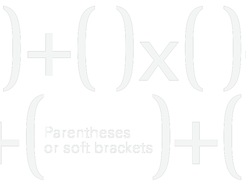
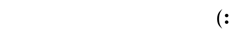
Parentheses are the most common punctuation marks and may often be used in formal writing to add supplementary information. While Parenthetical phrases have been used extensively in informal writing and stream of consciousness literature its main usage is in mathematics to signify a different precedence of operators and to set apart the arguments in mathematical functions. The Parentheses is also important for many emojis :)
Univers 55 Roman
Beirut
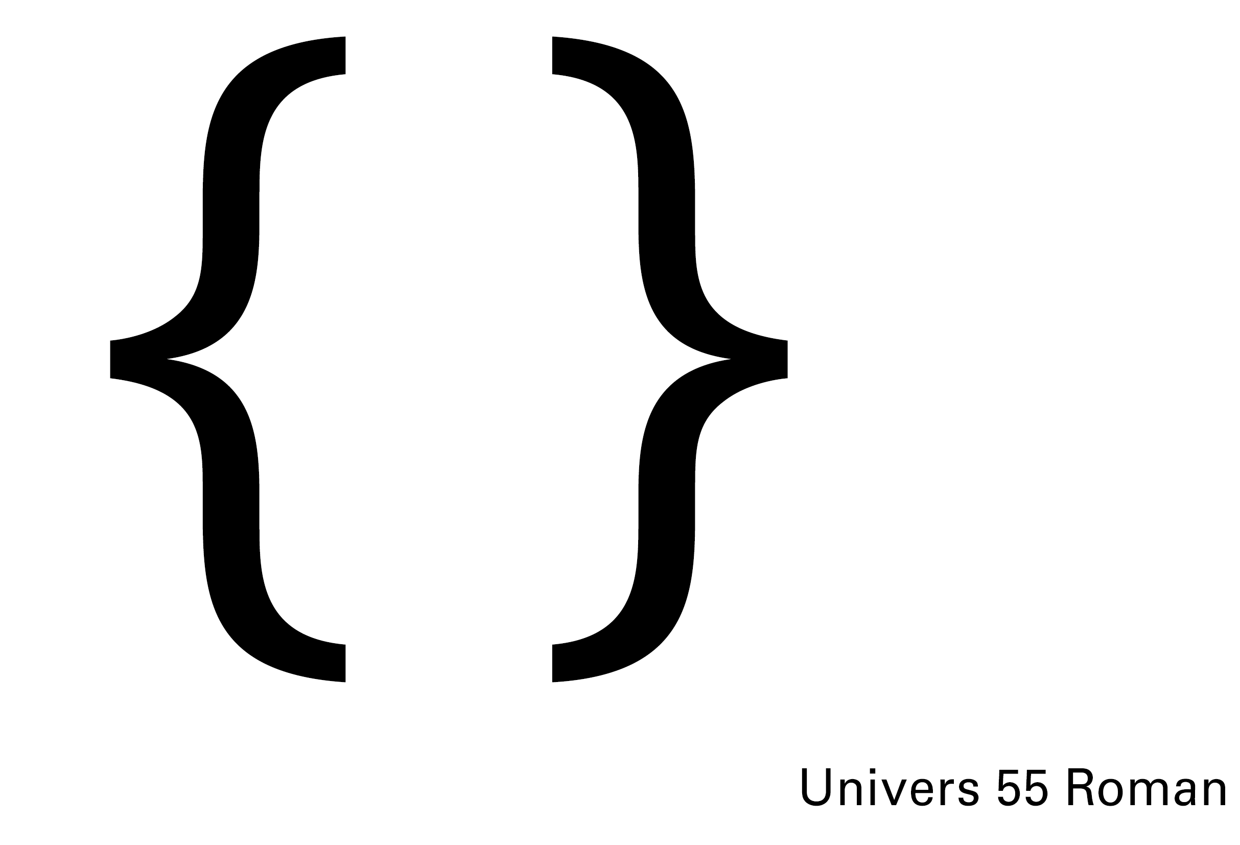
Univers is a sans-serif typeface designed by Adrian Frutiger in 1954. It contains a family of consistent, similar designs consistent typeface for all kinds of text. In 1997 Frutiger reworked the whole Univers family in cooperation with Linotype, thus creating the Linotype Univers, which consists of 63 fonts. This Website also uses Univers 55 Roman and Univers 45 Light.
Univers 55 Roman
Rotis Semi Serif
Beirut
Univers 55 Roman
Rotis is a typeface developed in 1988 by Otl Aicher, a German graphic designer and typographer. The Rotis Semi Serif is a semi-antiqua with hinted serifs. It explores an attempt at maximum legibility through a highly unified yet varied typeface family that ranges from full serif, glyphic, and sans-serif. While it is a controversial typeface, nonetheless, it has experienced lasting staying power and a stalwart reputation in the design world.
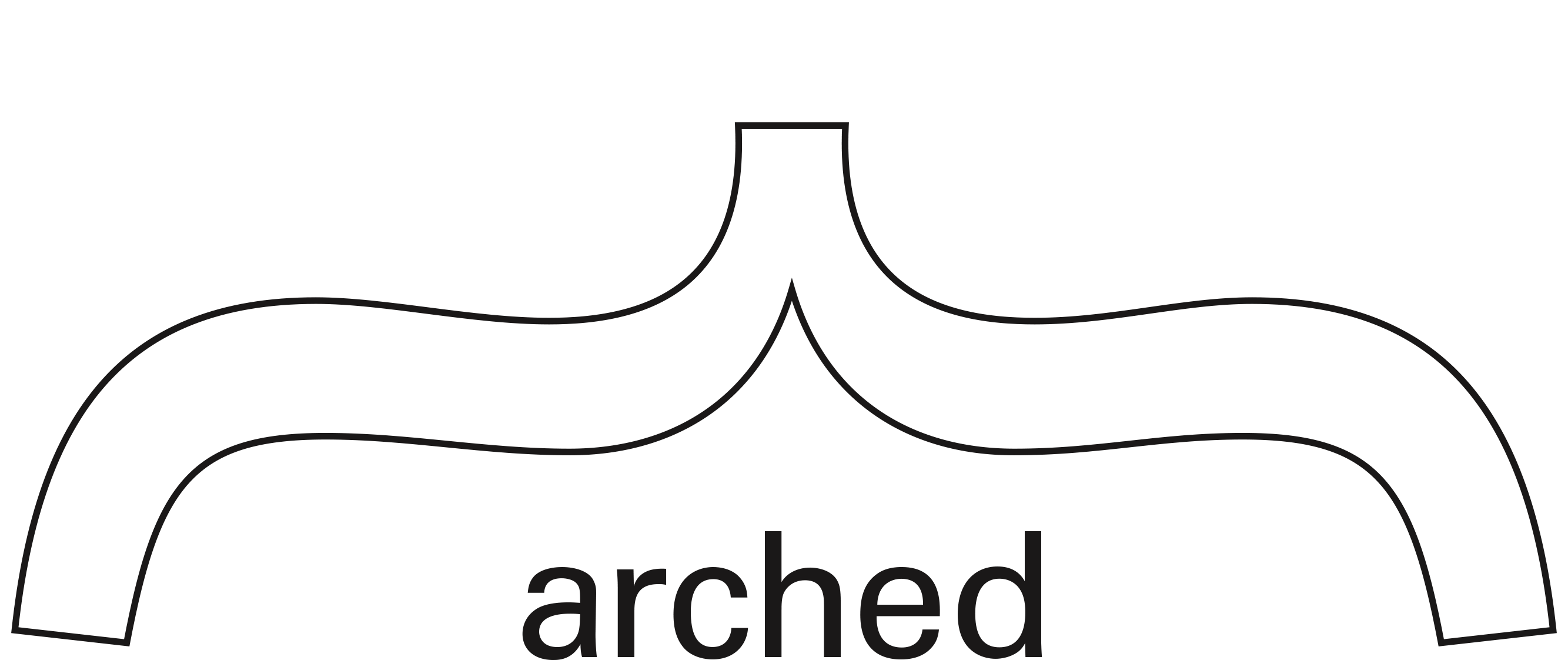
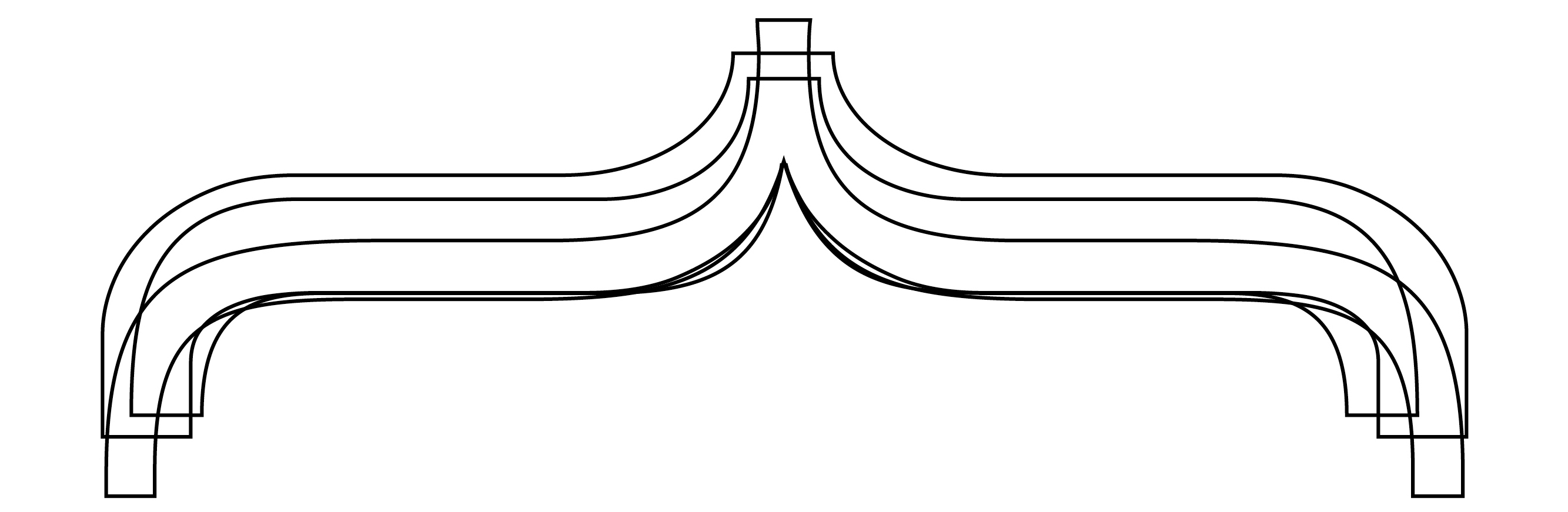
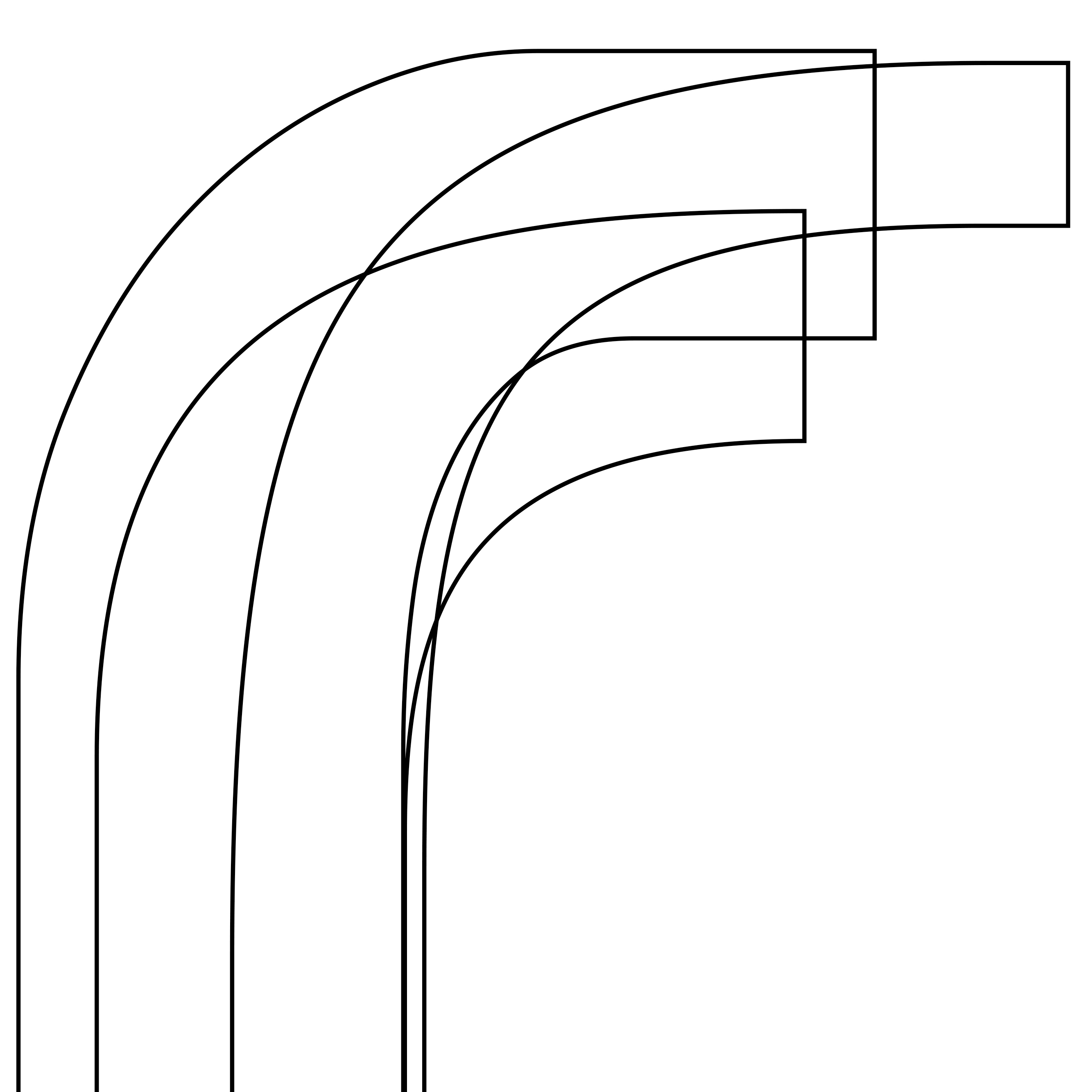
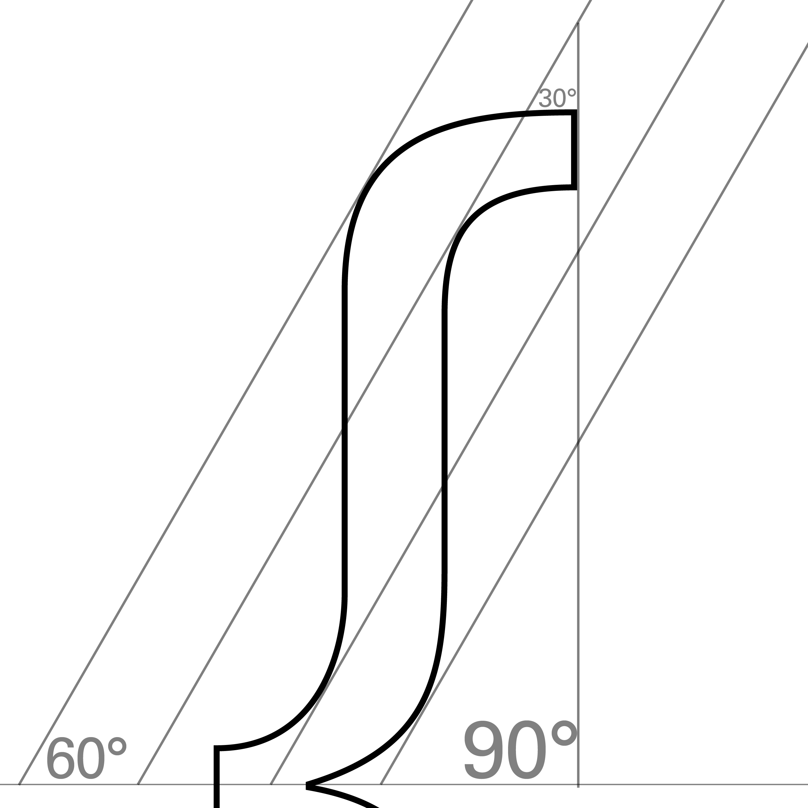
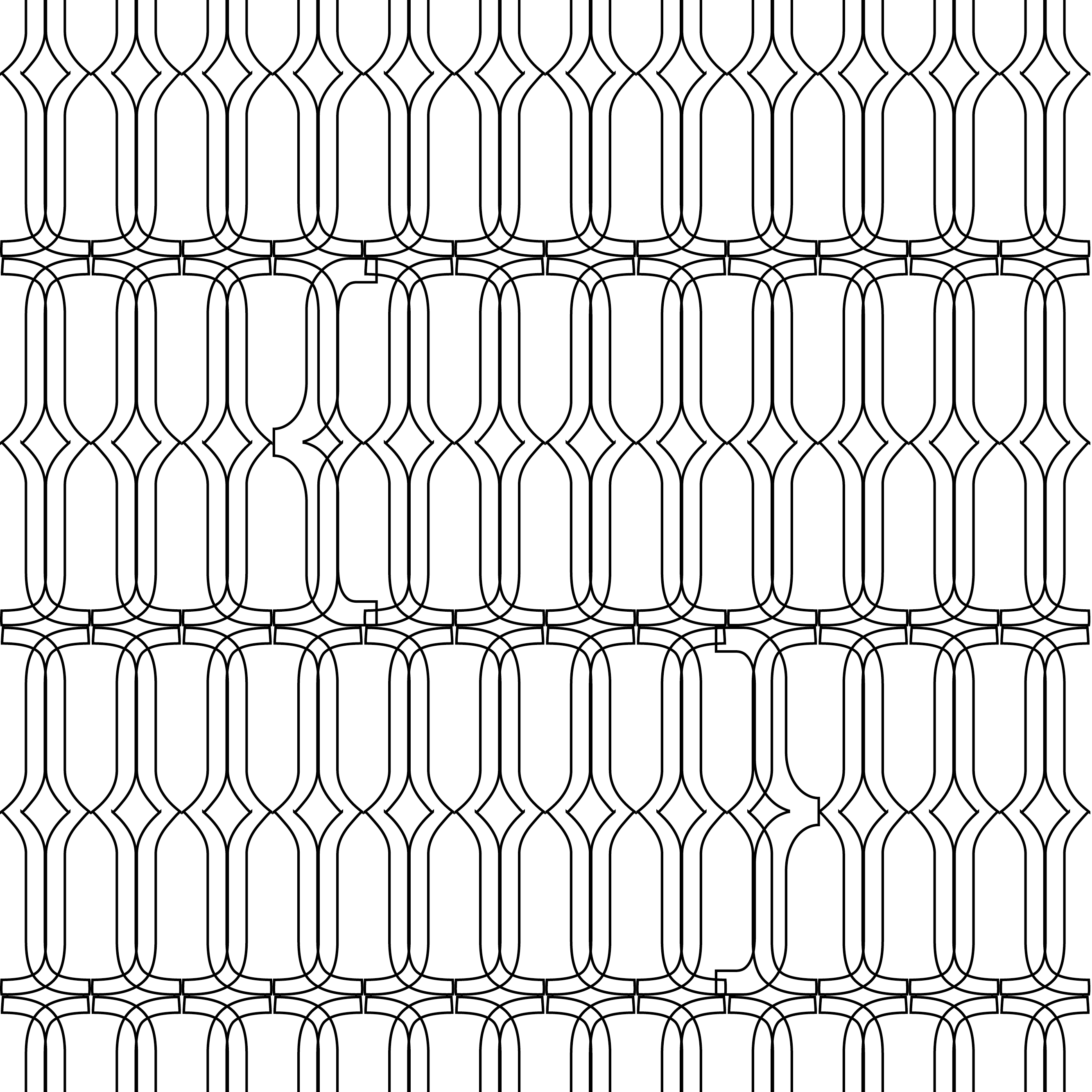
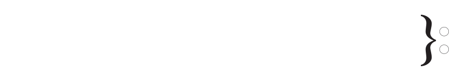
Curly brackets are used in specialized ways in poetry and music to mark repeats or joined lines. The musical terms for this mark joining staves are accolade and "brace", and connect two or more lines of music that are played simultaneously.
Univers Roman
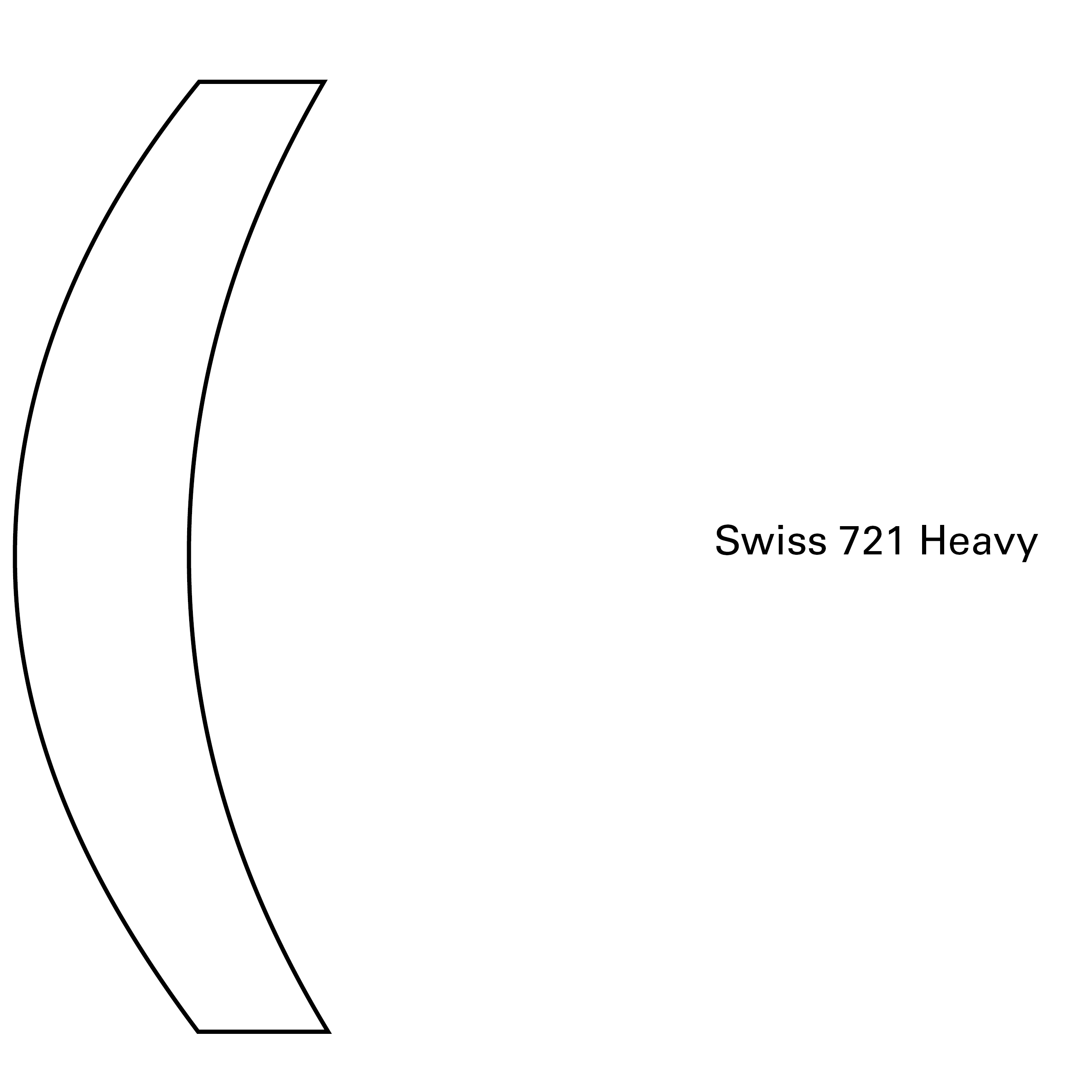
Swiss 721
Helvetica neue
Swiss 721 is a font from Bitstream library. It was designed by Swiss typeface designer Max Miedinger who also developed Helvetica in 1957. Swiss 721 is a Helvetica clone with condensed versions and a rounded version. It was among the first digitally available Swiss family typefaces, being designed for that purpose in 1982.
Helvetica Neue
Helvetica Neue is also very close to Helvetica. It is a reworking of the typeface with a more structurally unified set of heights and widths. It was developed at D. Stempel AG, a Linotype subsidiary. Erik Spiekermann was the design consultant and designed the literature for the launch in 1983. It is often said that the digital releases of Helvetica and all its relatives like Swiss 721 lost much of the warm personality of Max Miedinger's shapes and that it is a “one-size-fits-all“ solution.
Can you find the mistakes?
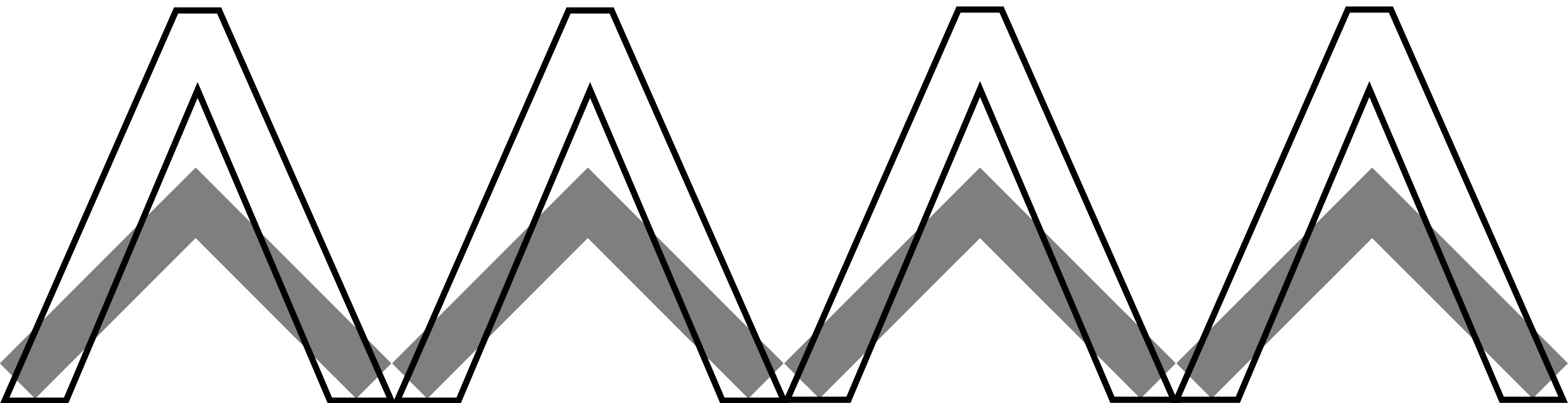
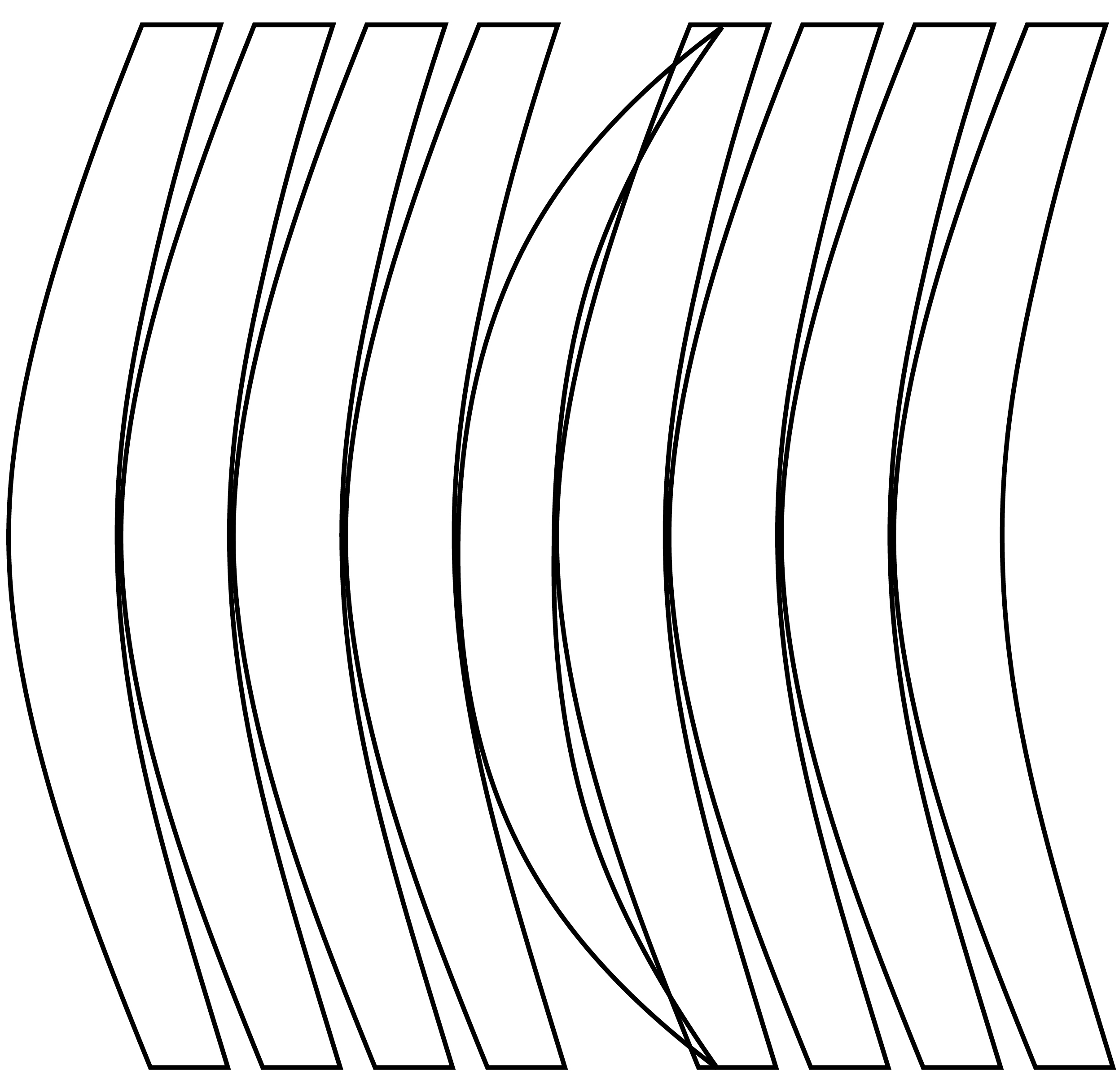
Pointy brackets are nearly never used in informal writing ore literature. But the mathematical or logical symbols for greater-than and less-than are inequality symbols. Chevrons ⟨ ⟩ are often used to enclose highlighted material. Single and double pairs of comparison operators are sometimes used instead of guillemets « » (quotation marks in many languages) when the proper characters are not available.
Beirut
Swiss 721
Helvetica Neue
Beirut was designed by Luzi Gantenbein and released in 2014. It is an Arabic font with thick baseline most suitable for titles and headlines.
Bau
Beirut

FF Bau is a sans FontFont by the American type designer Christian Schwartz marketed in 2002. It is based on Grotesk, a typeface released by the Schelter Giesecke typefoundry in Leipzig, Germany, at the end of the 19th century and used prominently by the designers at the Bauhaus. The italics were added in 2004.
Francis Stieglitz, Semesterprojekt Typografie, 2. Semester